Custom Components for Shopify App Blocks
Introduction
Use a Custom component when the Product Card Builder needs behavior or markup that is not covered by the built-in components.
To render one, drag the Custom component from the right sidebar into a Product Card block:
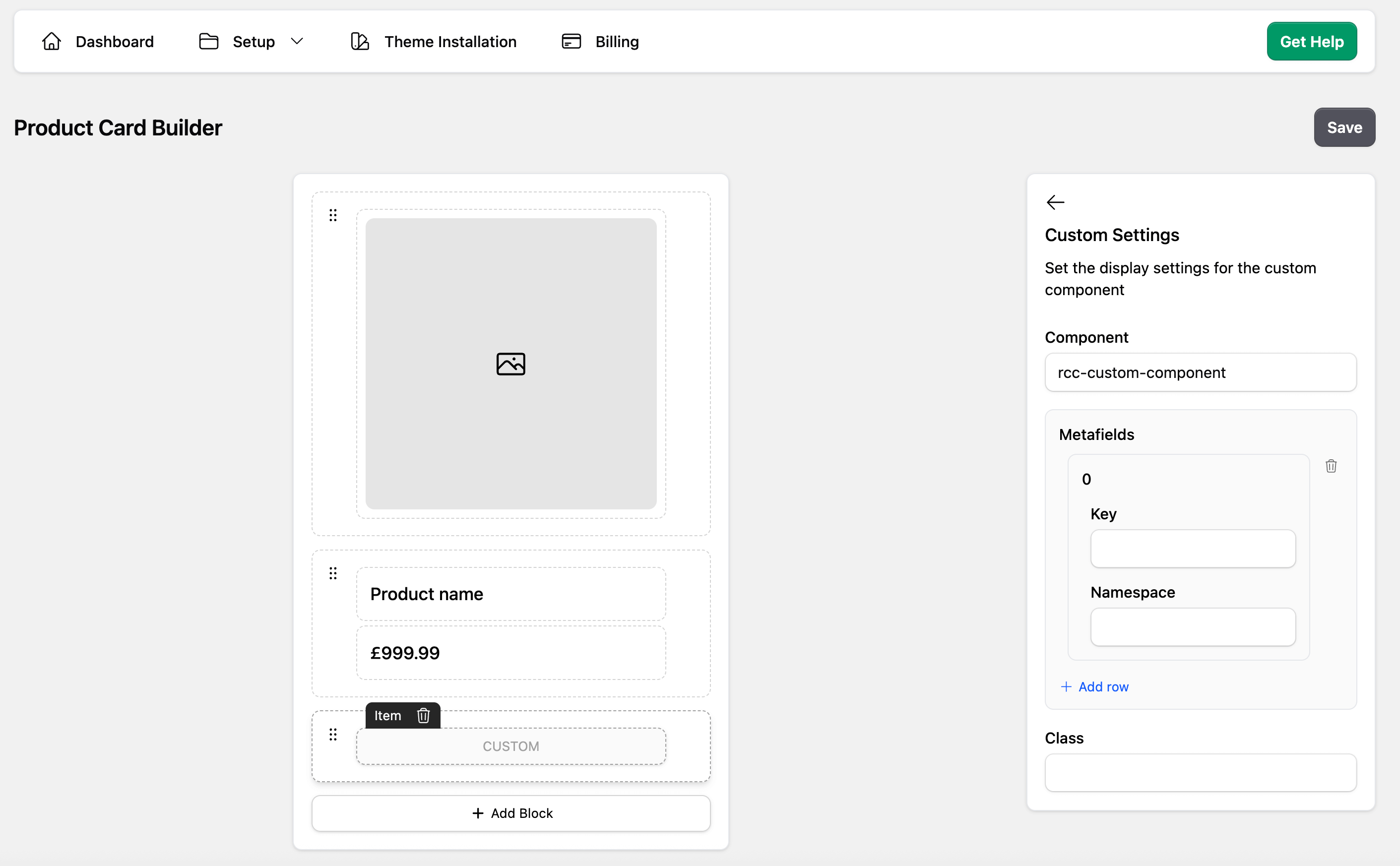
The Component Name must match a registered HTML Web Component:
customElements.define('rcc-custom-component', ProductCustomComponent);If the browser has not registered that element when the product card renders, the Custom component renders nothing. Load the custom component script before the Retail Cloud Connect App Block renders.
The Product Card Builder controls placement, the Web Component tag name, and Product metafields passed to the component. Extra Storefront GraphQL selections are code-driven in the component JavaScript and are not intended to be edited in the Product Card Builder.
Product Data Contract
The renderer creates the Web Component element and assigns product data as a JavaScript property:
element.product = {
  ...product,
  metafields: requestedMetafields,
  graphql: requestedProductData,
};
The product value is not serialized into an HTML attribute, so observedAttributes() is not needed for normal Product Card Builder custom components.
Configured Product metafields are passed as product.metafields in the order configured for the Custom component. A metafield entry can be missing when Shopify has no value for the product, so guard optional fields.
Custom Storefront GraphQL selections are passed as product.graphql. This value is the Storefront Product payload returned by the shared product-card batch request.
Search, collection, and recommendation cards can provide slightly different product shapes. Custom components should treat optional fields as optional, especially variant, image, rating, and metafield data.
Custom Component Example
(function () {
  'use strict';

  class ProductCustomComponent extends HTMLElement {
    set product(value) {
      this._product = value;
      this.render();
    }

    get product() {
      return this._product;
    }

    connectedCallback() {
      this.render();
    }

    render() {
      if (!this._product) return;

      const title = this._product.title || this._product.name || 'Product';

      this.innerHTML = `
        <div class="product-custom-component">
          ${title}
        </div>
      `;
    }
  }

  customElements.define('rcc-custom-component', ProductCustomComponent);
})();
When adding custom component JavaScript files to the theme, include them in theme.liquid before the App Block renders:
{%- if request.page_type == 'search' or request.page_type == 'collection' %}
    {{ 'rcc-custom-component.js' | asset_url | script_tag }}
{%- endif %}
Product Metafields
For simple storefront display, use the built-in Metafield component in the Product Card Builder.
For a Custom component, add each Product metafield in the Product Card Builder settings for that Custom item. The App Block batches those requirements with the product-card Storefront request and passes the results to the element.
(function () {
  'use strict';

  class ProductEnergyRating extends HTMLElement {
    set product(value) {
      const metafield = value?.metafields?.[0];
      const rating = metafield?.value || '';

      this.hidden = !rating;
      this.textContent = rating ? `Energy rating: ${rating}` : '';
    }
  }

  customElements.define('rcc-product-energy-rating', ProductEnergyRating);
})();
Then add the Custom component placement and its required Product metafields in the Product Card Builder:
{
  type: 'CUSTOM',
  component: 'rcc-product-energy-rating',
  metafields: [{ namespace: 'custom', key: 'energy_rating' }],
}
The builder does not fetch Shopify Variant metafields through a form field. If a card needs variant metafields, request them with a code-driven Storefront GraphQL selection as shown below.
Storefront GraphQL Requirements
There are times when the data from product is not complete enough for badges, swatches, quick views, or variant-specific metadata. In those cases, expose Storefront API requirements from the custom element instead of making one fetch per product card.
graphqlRequirements.graphql entries are Product selection set snippets, not full GraphQL queries. Do not include query, variables, or a wrapping product { ... } field. Alias custom selections to avoid collisions with built-in product fields.
(function () {
  'use strict';

  class ProductWarranty extends HTMLElement {
    static get graphqlRequirements() {
      return {
        graphql: [
          `
          warranty: metafield(namespace: "custom", key: "warranty") {
            value
          }
        `,
        ],
      };
    }

    set product(value) {
      const warranty = value?.graphql?.warranty?.value || '';

      this.hidden = !warranty;
      this.textContent = warranty;
    }
  }

  customElements.define('rcc-product-warranty', ProductWarranty);
})();
Use an aliased nested selection when a component needs variant metafields:
(function () {
  'use strict';

  class VariantRrp extends HTMLElement {
    static get graphqlRequirements() {
      return {
        graphql: [
          `
          variantMetafields: variants(first: 100) {
            nodes {
              id
              rrp: metafield(namespace: "custom", key: "variant_rrp") {
                value
              }
            }
          }
        `,
        ],
      };
    }

    set product(value) {
      const selectedVariantId = String(value?.variantId || '');
      const variant = value?.graphql?.variantMetafields?.nodes?.find((node) =>
        String(node?.id || '').endsWith(selectedVariantId),
      );
      const rrp = variant?.rrp?.value || '';

      this.hidden = !rrp;
      this.textContent = rrp ? `RRP ${rrp}` : '';
    }
  }

  customElements.define('rcc-variant-rrp', VariantRrp);
})();
Custom elements must be registered before the App Block reads the product-card layout. Components registered later can still render, but their data requirements may miss the first batched Storefront request.
Direct Storefront Fetch Fallback
Prefer graphqlRequirements for product-card data because the App Block batches the request. A direct Storefront API fetch inside a custom element should be a fallback for shopper actions such as opening a quick-view modal after the card has rendered.
The Storefront API token is available on Retail Cloud Connect App Block containers. Search and collection pages use .rcc-search; recommendation blocks use .rcc-recommendations.
async getVariantRrpAfterClick(variantId) {
  const token =
    document.querySelector('.rcc-search')?.dataset.token ||
    document.querySelector('.rcc-recommendations')?.dataset.token;

  if (!token || !variantId) return null;
  const numericVariantId = String(variantId).replace(
    /^gid:\/\/shopify\/ProductVariant\//,
    '',
  );
  const variantGid = `gid://shopify/ProductVariant/${numericVariantId}`;

  const query = `
    query getVariantMetafield($id: ID!) {
      node(id: $id) {
        ... on ProductVariant {
          rrp: metafield(namespace: "custom", key: "variant_rrp") {
            value
          }
        }
      }
    }
  `;

  const response = await fetch('/api/2025-07/graphql.json', {
    method: 'POST',
    headers: {
      'Content-Type': 'application/json',
      'X-Shopify-Storefront-Access-Token': token,
    },
    body: JSON.stringify({
      query,
      variables: { id: variantGid },
    }),
  });

  const data = await response.json();
  return data?.data?.node?.rrp?.value || null;
}
Checklist
- Add a Custom item in the Product Card Builder layout
- Register the Web Component before the Retail Cloud Connect App Block renders
- Keep the component name stable after publishing
- Configure Product metafields in the Product Card Builder
- Keep GraphQL selections in component code with
static graphqlRequirements - Guard optional fields for search, collection, and recommendation placements
- Use direct Storefront API fetches only for interaction-time fallback data