
Shopify Product Card Builder
The Product Card Builder controls the product card layouts used by Nimstrata Search Results, Product Grid collection pages, Dynamic Autocomplete, and Recommendations AI App Blocks.
It does not replace Shopify's native product cards outside the Nimstrata storefront experience.
Build in Production or a Profile
The page header's Editing Production or Editing profile name pill controls which product card is being changed. Template selection, builder changes, starting without a template, and clearing the layout remain in the current page draft until the merchant uses Save. Discard restores the saved layout for that Production or named profile.
Named profiles can be assigned to selected Search Results, Product Grid, Dynamic Autocomplete, and Recommendations AI theme surfaces before their product card is promoted to Production. See Storefront Settings Profiles for the complete create, compare, publishing, and promotion workflow.
Choose a Storefront Surface
The builder has four tabs:
-
Search & Collections is the standard card for Search Results and Product Grid collection pages. It is also the fallback for Dynamic Autocomplete and Recommendations.
-
Autocomplete can use its own card. Until it is customized, every product row—including search previews, recommendations, and bestsellers—uses the Search card. A customized card supports every configured component, including options, basket actions, and Custom components; the Search fallback omits those interactive components.
-
Recommendations can use its own card for the standalone Recommendations AI App Block.
-
Chat is disabled and marked Coming soon. Chat cards are not changed by this page yet.
Choose Customize Autocomplete or Customize Recommendations to start with a copy of the current Search & Collections card. Choose Use Search & Collections Card, clear the specialized card, or save it without components to restore the Search fallback. Search and both optional cards are part of the same Production or named-profile draft and save together. The Product Card Links setting remains shared by Search, Dynamic Autocomplete, and Recommendations.
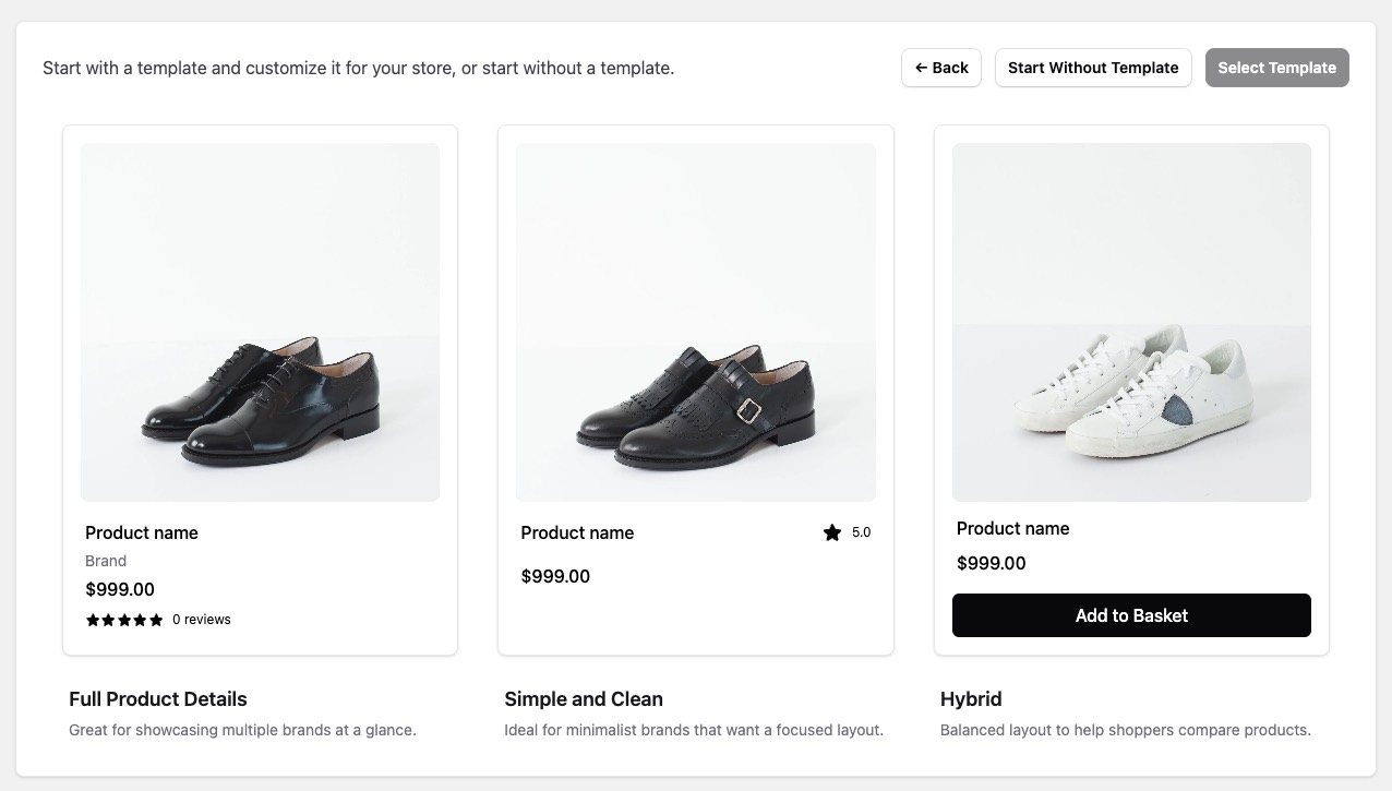
Start With a Template or Start From Scratch
When the builder opens, merchants can:
- Start with a Nimstrata template
- Start without a template and build a custom layout
Templates are the fastest way to launch. Merchants can then refine the layout to match storefront branding, product data, and conversion goals.
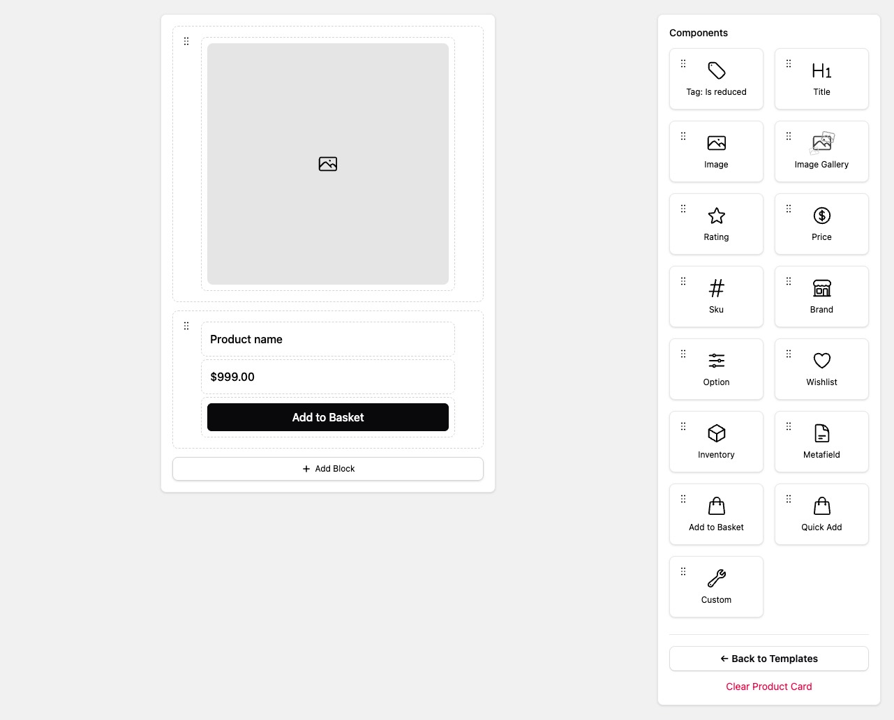
When starting from scratch, choose Add Block before dragging components into the card. The component palette becomes available once a block exists. Image and Image Gallery previews use sample catalog images when available; these samples do not change the saved layout.
Once a block exists, Developer Tools → Show CSS Classes replaces previews with the storefront CSS classes for each block and component. Choose Hide CSS Classes to return to the visual preview. Removing the final block also resets this view.
Component Types
The builder can assemble standard product-card components without theme code:
Horizontal blocks can contain up to two child components. Use this for compact rows such as brand plus badge or price plus inventory.
The Image Gallery component lets shoppers flip through product images directly in the results grid on mobile.
The Rating component can display the exact filled-star value or round it to the nearest quarter, half, or whole star. Star rounding does not change the numeric rating shown to shoppers.
Price component: From with strikethrough
The Price component offers Price, Price Range, From Lowest, From with strikethrough, and To Highest display modes. Existing saved cards keep their current display mode. Merchants can select From with strikethrough in the Price component to show from $49.00 with a crossed-out compare-at price when the lowest-priced variants are on sale.
- From Lowest, Price Range, and To Highest keep their existing styling. They do not gain a strikethrough automatically.
- From with strikethrough uses the same current-price color and compare-at styles as Price. When several variants share the lowest price, all must have a compare-at price above their current price. The lowest compare-at price among those variants is shown.
- When the complete set of variants for the card cannot be verified, From with strikethrough shows the regular
fromprice without sale styling. A complete set of exactly 100 variants is supported; a partially loaded set is not. - When all variants have the same price, every display mode uses the standard Price display, including its selected variant's sale styling.
Product Metafields and Custom Components
If the storefront design needs more than the default card elements, merchants can:
- Add product metafields to the card layout
- Use Custom Components only when the built-in card components are not enough
- Declare code-driven Shopify Storefront API requirements on a custom component when extra product data is needed
The Product Card Builder supports product metafields. Variant metafields are not available through builder fields and require code-driven Storefront GraphQL requirements inside a custom component.
Custom components are a good fit for advanced badges, quick views, wishlists, extra product metadata, or layouts that need custom JavaScript behavior. Adding a JavaScript file alone is not enough; merchants must also add a Custom component to the Product Card Builder layout. Custom component Product metafields are configured in the builder; custom GraphQL requirements live in the component code, not in Product Card Builder fields.
Product Card Links
Use Layout Settings to choose whether product cards link to the selected variant or the main product page without a variant in the URL.
Good Practices
-
Keep image, title, and price above the fold on the card
-
Use consistent card heights to avoid uneven grids
-
Test customized layouts on search, collection, Dynamic Autocomplete, and standalone recommendation placements
-
Guard custom components for missing optional fields because search and recommendations may provide different product shapes
-
Fix data quality issues in imports first, then refine card design